I joined the leading discount grocery retailer to work on translating the unique discount experience of ALDI to the digital space, building digital products for e-commerce and returning customers.
Numbers, details and proprietary visuals like fonts and icons have been modified or omitted to respect confidentiality agreements and copyright. The work shown does not necessarily represent final or publicly released products.
Making Customer Support "ALDI-Simple"
As the leading designer within ALDI’s CIAM teams, I helped define and evolve the end-to-end shopper account experience. From sign-up to dashboards, and also customer support. The contact form was one of ALDI’s most-used online touchpoints but also one of its most painful. It became the perfect case to demonstrate how UX can make digital interactions as clear and efficient as interactions in the stores.
The Challenge
The existing form attempted to show every possible reason a customer might contact ALDI on a single page. Internally, the form was meant to guide and limit requests, but in practice it created a bad experience on both sides:
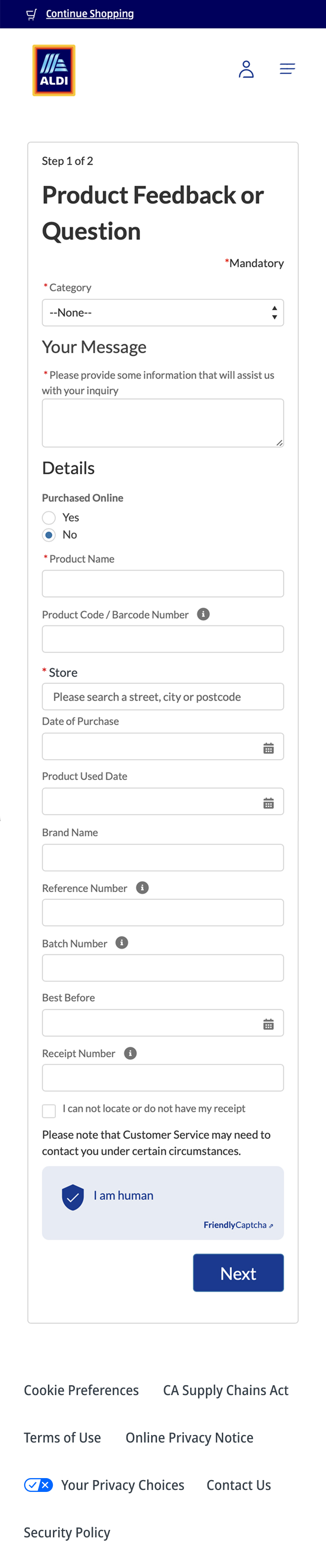
-
High user drop-off rates
The amount of required information discourages users from attempting contact.
-
Incomplete tickets
Frustrated shoppers providing “keyboard-smash” data to get around limited forms.
-
Long wait time
Agents receiving incomplete or misrouted tickets that cause long response times or lacking support options.
The result: large contact volume with poor data quality. The exact opposite of what the system intended.
Research & Discovery
Before sketching solutions, I needed to understand what shoppers were actually trying to accomplish, and what the business was trying to avoid.
The old form had been designed around internal logic, not real user intent, so this phase focused on reconnecting both sides.
Through mapping inquiry types, customer-service feedback, and support transcripts, three consistent needs emerged while parallel stakeholder interviews and service-center metrics revealed complementary business drivers:
-
I Get Information Fast
“where is my order?”
“I found this ALDI gift card but don’t know how much is on it”
-
I Get Problems Resolved Quickly
“My ALDI airfryer Shows ERROR 3?!”
“I got charged the wrong amount and need to fix that”
-
I Can Contact ALDI Myself
“I need to speak to the manager!”
Shopper Needs
-
Low Service Center Contact Rate
Make sure Shoppers can answer their own questions!
Allow the Shopper to use the self service features instead!
-
High Solution Rate on Contact
Only provide contact if a solution is probable!
Ask all necessary information up front to enable Agents!
-
Quick Turnaround on Service Ticket
Set expectations correctly!
Minimize back and forth between Agent and Shopper!
Business Needs
Design Solutions
Based on the mapped shopper and business needs, I defined several UX strategies to make the new contact flow more intuitive, efficient, and self-sufficient, while maintaining ALDI’s signature simplicity and honesty.
Keeping it Efficient: Broad-to-Detailed Funnel
the old form asked for information before understanding intent. The new experience should first understand why a user is contacting ALDI, then ask only what’s necessary.
Shoppers first select from clear, top-level help areas such as Orders, Products, or Stores, then refine their reason step by step. This progressive disclosure makes the interface feel light and keeps decision-making simple.
Different shoppers frame problems differently. For example, stock inquiries can live under both the “Stores” and “Products” sections. By allowing multiple paths to reach the same funnel, we ensure every shopper still ends in the correct place regardless how they approach the topic.
Keeping it Clear: Early Self-Help Introduction
Once intent is clear, users are shown relevant self-service options before reaching support. They appear at the end of the funnel, when it’s most useful, not as a roadblock to fend off requests.
To achieve this, I defined a hierarchy of self-help options, ordered from most critical to least, based on immediacy and relevance to the user’s intent:
-
System Health Warnings
If technical or operational disruptions exist, these appear first before any further steps to set expectations and proactively inform before effort is wasted. Example: “Delivery disruptions due to weather events”
-
Self Service Tool
If available, shoppers are guided toward direct self-service tools that let them complete tasks instantly without contacting support. Example: Warranty lookup, Gift card balance check, account recovery tools.
-
FAQs (Guided Answers)
the system shows contextual FAQs based on the shopper’s selections. These provide short, relevant answers. Example: “How long does delivery take?”, “What is ALDI’s return policy?”
-
Contact ALDI (Manual Support)
If none of the above paths resolve the issue, manual contact is available. Contact is always positioned as the final option, but it remains always visible, never hidden behind walls of help articles or bot dialogues.
Keeping it Simple: Conversational Input Interface
If human contact is needed, the form turns into a guided conversation: one question at a time, simple and easy to understand and adapting based on prior answers.
This keeps the process quick, personal, and brand-aligned: efficient without pretending to be a chatbot.
Outcome
The conversational contact flow went live in test markets and quickly showed measurable improvements in both user experience and operational efficiency.
-
Cleaner Data for Agents
Reducing average handling time per ticket.
-
Self-service adoption
FAQs and system info now resolve inquiries without human contact.
-
Higher consistency
the conversational pattern was adopted by other teams for onboarding and internal store employee support.
This project proved that meaningful simplicity is strategic, not aesthetic.
The redesign reduced friction for shoppers while simultaneously lowering costs for the business: A true embodiment of the ALDI discount DNA.
From this project onward, i established a blueprint for how UX needs to express ALDI’s brand values operationally:
-
Value Driven
make every Interaction worth it
-
Honest
no hidden costs (or steps)
-
Efficient
Respect the user’s time
-
Simple
remove friction and noise: prioritize what matters
Discount As an Art of Reduction
ALDI’s recipe for success is focusing relentlessly on simplifying processes, stores, and product ranges to create the best possible value for its customers. Its this art of reduction that makes customers fall in love with the discounters unique simple, honest and efficient experience.
Inhere lies the big challenge and my task during my time at ALDI: Translating this recipe for success to the digital world.