How I accidentally made my portfolio awesome (by trying to improve accessibility)
For the past two days, I’ve spent vibe-coding a fix to a problem that kept bothering me for a long time: my portfolio and its accessibility.
My portfolio is highly visual, highly interactive, and very deliberate in how it’s experienced.
But only if you’re sitting in front of a big screen, paying attention, taking your time. The moment you step outside of that, it kind of falls apart.
On a phone it’s annoying. If you just want a quick overview, it’s too much. If you don’t feel like actively scrolling through everything, there’s no real way in. And most importantly, if you are visually impaired, the page has nothing for you.
And that bothered me, because I realized I had basically designed something that only works under ideal conditions.
The looming realization
At the same time, I kept seeing more designers record walkthroughs of their work. Just talking over their portfolio, explaining things while scrolling.
It’s arguably a great fix to that exact issue.
But it also has a big downside: It doesn’t allow the visitor to explore and wander on their own, something super important about good storytelling in user experience in my eyes.
Also, all Portfolios I’ve seen in that format use Loom.
I don’t want to give up control over the experience, especially not in a portfolio that’s supposed to showcase my thinking as an experience designer. And especially not to Loom.
We have Loom at home
So instead of the walkthrough being a video of my website, I decided I would bring the narration into my website directly:
- The page scrolls itself to the important parts
- My voice narrates it
- Elements get highlighted as im talking about them
- The user can always decide to intervene and explore
Same content. Different way to experience it: A guided mode.
The unexpected tool: subtitles
The interesting part was how to actually sync everything. And that’s where subtitles came in.
In my past I’ve dabbled in video-podcasting and YouTube video production, and many of Youtube’s features are powered by VTT files.
The file format is made for subtitles, but essentially is just a text-file of timestamps, allowing you to mark anything in the timecode of a video to appear at a certain section, like chapters, info cards or annotations.
So I planned to “hack” the file format to contain two things:
Visible subtitles → what the user reads
Hidden markers → instructions for the site
For example:
00:00:00.000 –> 00:00:02.760
“This is the onboarding flow…”
@scroll#onboarding
@highlight#cta
The entire behavior of the page is driven by the same file that also contains the narration and is synced to the video at all times. The structure of the guided tour is all in one place.
Vibe coding as a designer
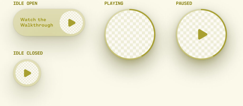
The concept is clear: A vtt file alongside a video as the audiovisual layer and instructional layer of this walkthrough experience. A floating little video player that almost disappears and becomes a floating head, familiar to everyone watching screencasts. Subtitles across the bottom, like in a video.
A familiar experience that makes the user lean back and watch. It feels like a video, but it’s my website.
I gave Claude Code the brief, and it got to work, creating an almost perfectly working prototype of exactly the functionality.
But… It looked nothing like what I envisioned. And so the 5 minutes of quick and easy AI prototyping were followed by hours of painstaking attempts to prompt the UI to my specifications. And the same AI model that was just able to mind-read my idea into reality before all of a sudden became completely unable to understand anything.
Eventually I had to restart my approach as I realized, that even as someone with limited coding knowledge, I had a better change at making the front end myself and let Claude wire in the functionality.
The takeaway for me here was that generative AI will definitely get the job done, but not in the way you want it done.
Accessibility as a driver of innovation
But the more important realization was something else:
This whole thing started because I wanted to make my portfolio more accessible.
For people on smaller screens, for people who don’t want to click through everything, for people who just prefer being guided.
And what I ended up building wasn’t just more accessible. It was a cool new way to experience my portfolio. By trying to remove friction for some people, I ended up improving the experience for everyone.
Which is probably the most useful reminder in all of this:
Accessibility isn’t just about supporting edge cases. It’s about removing unnecessary friction.
And once you start doing that, you don’t end up with a “more accessible” product.
You end up with a better one.