Absolutely no one:
Me, having the slightest frustration while commuting:
Here is a full redesign…
Absolutely no one:
Me, having the slightest frustration while commuting:
Here is a full redesign…
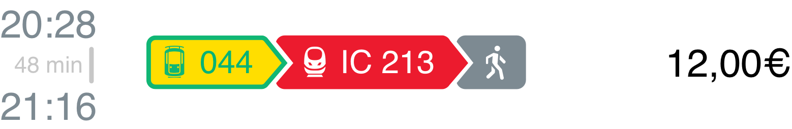
The information that matters for your journey, visually at a glance, easy to digest.
Train or commute-type colors are referenced all throughout the UI to make wayfinding easier.
Detailed train type icons representing the most popular train types further help getting on the correct train.
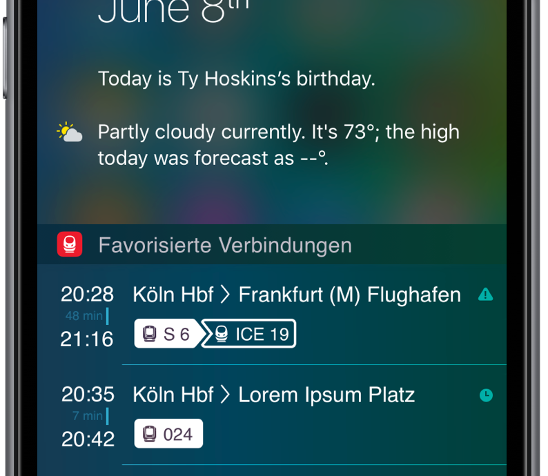
The connection information views are designed to work beyond the app and fit into the life of a busy commuter or traveler.
Realtime map-view makes changing connections easier and less stressful.
How could those concepts be applied to public ticket machines that are notoriously hard to use?
to be
continued...